Saturday, July 21, 2012

Blog Entry #4 – Mini Art School: Working with Digital Images - Typographic Conveyance

**Note to Self** "SAVE" is not the same as "PUBLISH" Ugh. There are some things that no course can teach!

 
(Above)
Typed in Powerpoint using Rockwell Extra Bold.  Saved as JPEG.  Opened in Paint and used Erase function to create shred lines.
PPT again.  Found a clip art of a shredder.  If I had better graphics software I would take the given clip art and skew it so the "S" is more pronounced.
Using Word Art in MS Word I added a brick pattern to the word brick.  I copied, pasted, shrunk the word as I stacked them on top of each other like bricks.  I played around with a few shadows but none gave me the tall building look I was going for.
Word Art again.  Added a bunch of extras - shadow, gradient fill and outline, glow.  Anything that seemed to make the letters look soft and fluffy.

Blog Entry #4 – Mini Art School: Working with Digital Images - Cropping Exercise

**Note to Self**  "SAVE" is not the same as "PUBLISH"  Ugh.  There are some things that no course can teach!

*Note* I apologize for the formatting!  In the editting stage the photos and text lined up so perfectly.  Upon publishing I realize that the editing page and actual page are very different in size so my layout got a bit tweaked.  Still learning!


In this photo cropping exercise, I labelled the original photo (although it is generally obvious which came first) but I staggered the order of the photos to allow for a different perspective each time.  Like reading a book and seeing a movie - your opinion of each often depends on which you did first.


A church in Old San Juan, Puerto Rico
This is a typical vacation photo that I took.  Just snapping away at scenery to try to keep a memory of the trip alive.  I really enjoyed the colors of the church, as well as the colors of the area over all - pretty pastels and brights - typical of the Caribbean.  I liked this church because of its details and the stair step shape from left to right. 
I made the above-left crop in an attempt to straighten out the picture (it is a little crooked) and capture the details that I liked the most.  I enjoy the symmetry of the columns, arch, and scallop details at the top.  I also cropped out the cross at the top.  I wanted to focus on the architectural elements without focusing on what type of building it is.
The above-right cropping further highlights some of my favorite features of the structure - the overall symmetry of the scallops and columns.  I also find the cut-out appealing.  I wish I could have seen this at a different time of day.  I am curious if the sun rising or setting would have cast a light through the hole.

Original Photo

A street in Old San Juan, Puerto Rico


I cropped this photo to give the feeling of a vacation postcard.  The bright colors with white details capture the feel of downtown.
Original Photo

This photo was taken to show the perspective of stair stepped buildings, bright Carribean colors and steep streets (with crazy parking). 


The cropping below becomes an advertisement for taking public transportation in Old San Juan, PR.  The street is very slanted, fairly narrow, and parking can be... confusing.


View from behind B&B in Ceiba, Puerto Rico


 The croppings of this photo actually serve to provide a better total memory than the original alone.  The smaller versions are able to accent the individual parts of the photo that help to stir up the memories made while taking them. 
Ideally, my eyes would be cameras and I could snap pictures while simply gazing at the view.  Since this is not the case I take as many shots as I can while still enjoying the view "live".


Original Photo

My postcard view!


El Morro Lighthouse - Old San Juan, Puerto Rico
Original Photo


My main goal in the left sample was to crop out the people.  The reality is that there are other people present when you go on vacation, however, my memories do not include these people so I will cut them out where I can!

Since the lighthouse was in the center of the picture with a lot of space on both sides as well as the top, I found this to be a good subject to crop in different arrangments.

Two of the croppings maintain the lighthouse as the center focal object while the other two anchor it in a bottom corner.


 A Winter Walk
 This is a typical scene from my preschool in the winter.  Take away the snow and gear and the general discombobulation of the photo is typical anytime of year!
Original Photo
This crop would be perfect for our End of Year photo montage.  We like to include photos that show just how small our kids once were.


Let's crop those teachers out!  They aren't what the photo is about anyway!

A calm winter scene - no indication of the toddler craziness that abounds just a few yards away.

Friday, July 13, 2012

Mini Art School: White Space - Try This pg 84 #3

Gestalt Logos

Let's play GUESS...THE...LOGO!

Rules: You try to guess the logo while I try to describe the Gestalt Theory I feel to be at work in each. (The answers are at the bottom but I know you won't need them!)

This logo uses proximity by the two objects being very close together, almost linked but upon inspection, the two never actually cross paths, link or connect in any way.  I believe the idea of closure is also at play in that the two shapes create the idea of two closed linked circles but, in fact, they are not.


This logo has no lines drawn nor does it have solid fill.  The law of proximity is at work here.  The individual (and sparkly!) pieces of this logo are arranged in such a way to suggest the shape of a bird.  The lack of pieces in certain areas give the placement of an eye, the curve of the neck, and the loose, feathery tail end.


 This logo employs the idea of closure.  While there are arrows at the ends of 3 of the shapes, the other 2 pieces look like rectangles with two of their corners sloppily chopped off. The curve of each piece gives the illusion of a flat, thick arrow (with a white edge), bent around to form a circu-triangular pattern.  Also demonstrating continuity, this logo is used to exemplify three Earth-friendly practices that go well together and should repeat indefinitely.   


Sorry! No guessing here!

And finally, an example of similarity (which I found the most difficult of the 4 to understand and find).  In this logo, the squares and rectangles stacked together form buildings, the colors emphasizing the different heights and spaces between.  The "sky" is also a grouping of similar shapes (stripes) grouped in a similar color pattern, including the double red.


Scroll past here without reading the top and thinking for a minute and you are a

cheater, cheater, pumpkin eater!


They give a warm cookie upon check in!


Ahh, I love all things sparkly!


Yes, please! Keep our Earth green and clean!

Wednesday, July 11, 2012

Mini Art School: Word Portraits Exercise

Typography

**I accidently published this (instead of just pressing SAVE) before it was done.  If you are reading this message, go ahead and take a look but I am not finished!  If you know how to unpublish something after it is published then please let me know! **

40+ pages on fonts?!?  Seems excessive.  But Krause could not produce that many if people did not demand (and create) such variety.

I created these word portraits in Powerpoint and saved each slide as JPEG.  I like powerpoint.  =)

I began this exercise by exploring a number of fonts using my name.  I figured it was short and I could fit a lot of them on one page to be able to compare.  The only downside to using my own name is that two out of its four letters are the same.  Still, it gave me a one page look at 20 different fonts.  I chose some fancy, some hand-written style, and some traditional.  All of my sample fonts are in the same size (54).  The variety of visual size is due only to the properties of each font.
I chose a variety of fonts that seemed to have a strong personality.  I was hoping that the fonts themselves would speak to me and inspire words that would be enhanced by using such fonts.
I came across Papyrus, an aged-looking font, conjuring up an image of an old scroll with ancient writings on it (Row 3, Column 2 of Taras). I added to the feel of the font by fading the color from black to light gray.
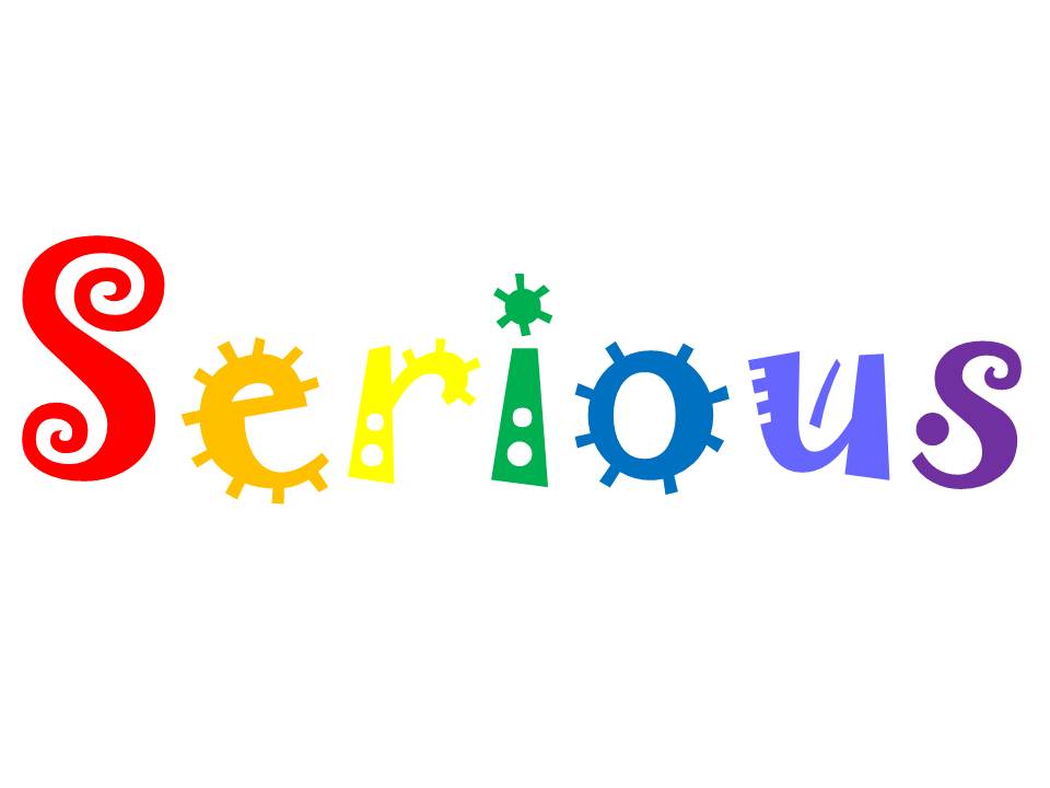
My next selection was "Jokerman" (row 2 column 5 of Taras) which immediately looks and feels fun, circus-like, and a bit like a child's doodles. I was not sure which way to go, but decided to use it as the example of contradiction. In this example, I again used color to aid in the feeling the font helps to create. The silly, slightly off-kilter font in ROY G BIV order is definitely NOT Serious.
The portrait featuring the word ART was created using stock clipart images of letters (search clipart for letters, alphabets, etc). I found this was an easier arrangment (the diagonal) than trying to type individual text letters and moving them around as objects or using crazy formatting. 
  

The additional images presented were simply fun to create.  They were inspired by this assignment but do not necessarily fit the parameters but I thought I would just put them in at the end.
 The above images were selected to spell something we are all familiar with.  When a person using sign language is spelling words (because someone needs it spelled or because there is no official sign for that word) it is called finger spelling.

I stumbled across these clip art letters and wanted to find out if the whole alphabet was available.  I believe they are.  For some reason, despite each letter being the same dimensions exactly, the "N" is taller than the rest.

I would LOVE this to be an available font to type with or, perhaps, Word Art or similiar tool within MS Word or PPT.  I am a preschool teacher and blocks like these are a staple.  I like that I found two images with words related to finance.  In both cases they indicate upwards movement but in very different ways.


This final slide was my attempt at "Doctor writing".  My 3rd grade teacher told me that I would grow up to be a doctor because my handwriting was so poor.  Fortunately, my current doctors print out all of their prescriptions or e-scribe them straight to the pharmacy.  I never really understood how that scribble got translated into the correct med & dose!
I used the font Mistral, made it italic, and condensed it (the opposite of the expand function I used many times as an undergrad to fill up a bit more space for papers!)  I drew a rectangle and filled it with a light green pattern for a prescription pad look.