Blue Buffalo
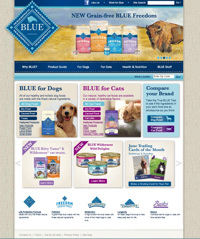
This website follows strict alignment rules as presented by Jim Krause in design basics index. It is structured around a grid system which works even though not all of the elements are the same size. The background of the page is a simple linen pattern, softer than a white background and giving the site a natural feel which supports the mission of the company - to provide natural, healthy and holistic pet foods. The color scheme for the site is consistent, using pleasing shades of blue and purple to make each section (dogs, cats, new items) stand out. It is not exactly monochromatic (Design Rules of Thumb) but does use the same family of colors to unify the space.
Personally, I like that the link colors do not change post-click. I find the super light blue of the links to be pleasing and would not like some to be different just because I had clicked on them. The site has two moving elements which move independently of each other. If not done properly, these could make the site unappealing to look at and difficult to navigate. The visual (white space is not your enemy) at the top is a picture link that transitions every 6 seconds or so, stopping while the mouse hovers over it. It has a gentle transition which is not harsh or distracting and provides tracking dots in the corner to go forward or back (some pages with transitions just make you wait until the one you wanted comes back around). The scrolling picutres at the bottom are uniform in size, scroll by every 10 seconds or so and also provide arrows on each side to expedite scrolling or move to the desired link without waiting.
One aspect that I find to be negative is the extreme center-alignment. Much of the site is center focused and 100% of the content is in the center of the page. Most computer screens are fairly wide these days and not that tall, so I do not find it effective to have all of the content in the very middle of the page. At viewing size of 100%, you have to scroll a bit to see the bottom of the page, yet the left and right sides (for my screen about 3-4 inches each) are completely blank.
The page is set up in the works-every-time style (white space is not your enemy) with the strongly anchored visual at the top and the elements neatly layed out. The elements which are imporant, yet not essential to the business are in smaller type but are still easily found ("like" button for facebook, career opportunities, etc)
The only part of the site that is important yet nearly completely hidden is what seems to be the mission statement at the bottom. It is nearly the same color as the background. While most people going to this website probably already know about the company because they are present customers or were referred by one, someone stumbling upon the site may not see the major different between this product and every other pet food without reading the company's mission of providing natural and healthy foods.
Over all, this site has a simple design which presents the products effectively and supports the mission of the company.