**I accidently published this (instead of just pressing SAVE) before it was done. If you are reading this message, go ahead and take a look but I am not finished! If you know how to unpublish something after it is published then please let me know! **
40+ pages on fonts?!? Seems excessive. But Krause could not produce that many if people did not demand (and create) such variety.
I created these word portraits in Powerpoint and saved each slide as JPEG. I like powerpoint. =)
I began this exercise by exploring a number of fonts using my name. I figured it was short and I could fit a lot of them on one page to be able to compare. The only downside to using my own name is that two out of its four letters are the same. Still, it gave me a one page look at 20 different fonts. I chose some fancy, some hand-written style, and some traditional. All of my sample fonts are in the same size (54). The variety of visual size is due only to the properties of each font.

I chose a variety of fonts that seemed to have a strong personality. I was hoping that the fonts themselves would speak to me and inspire words that would be enhanced by using such fonts.
 I came across Papyrus, an aged-looking font, conjuring up an image of an old scroll with ancient writings on it (Row 3, Column 2 of Taras). I added to the feel of the font by fading the color from black to light gray.
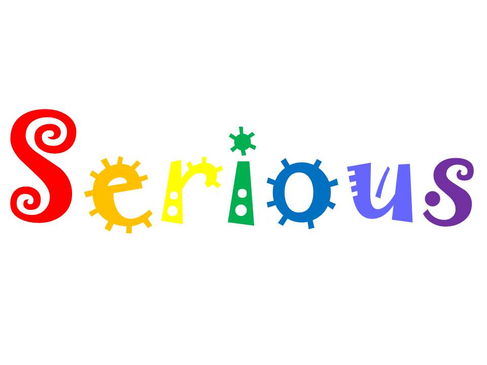 My next selection was "Jokerman" (row 2 column 5 of Taras) which immediately looks and feels fun, circus-like, and a bit like a child's doodles. I was not sure which way to go, but decided to use it as the example of contradiction. In this example, I again used color to aid in the feeling the font helps to create. The silly, slightly off-kilter font in ROY G BIV order is definitely NOT Serious.
 The portrait featuring the word ART was created using stock clipart images of letters (search clipart for letters, alphabets, etc). I found this was an easier arrangment (the diagonal) than trying to type individual text letters and moving them around as objects or using crazy formatting.
The additional images presented were simply fun to create. They were inspired by this assignment but do not necessarily fit the parameters but I thought I would just put them in at the end.

The above images were selected to spell something we are all familiar with. When a person using sign language is spelling words (because someone needs it spelled or because there is no official sign for that word) it is called finger spelling.

I stumbled across these clip art letters and wanted to find out if the whole alphabet was available. I believe they are. For some reason, despite each letter being the same dimensions exactly, the "N" is taller than the rest.

I would LOVE this to be an available font to type with or, perhaps, Word Art or similiar tool within MS Word or PPT. I am a preschool teacher and blocks like these are a staple. I like that I found two images with words related to finance. In both cases they indicate upwards movement but in very different ways.

This final slide was my attempt at "Doctor writing". My 3rd grade teacher told me that I would grow up to be a doctor because my handwriting was so poor. Fortunately, my current doctors print out all of their prescriptions or e-scribe them straight to the pharmacy. I never really understood how that scribble got translated into the correct med & dose!
I used the font Mistral, made it italic, and condensed it (the opposite of the expand function I used many times as an undergrad to fill up a bit more space for papers!) I drew a rectangle and filled it with a light green pattern for a prescription pad look.